
Purple - Design System
Designing the new Design System.
Read project
Background
While designing Luminy's platform, I faced significant challenges stemming from inconsistencies between the designs and the live application. It became increasingly clear that developers might be working with different sets of assets.
This highlighted the critical need for a unified design system to bring consistency and coherence across the platform.
a Sneak peak


Discovery
Challenge
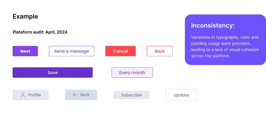
To confirm my suspicions that the developers might have been using different assets than us designers, I conducted a thorough audit. The results were revealing—there were substantial differences in the assets, with numerous variants of buttons, badges, and other components, leading to a fragmented and inconsistent user experience.
We aimed to modernize the platform’s look to make it more visually appealing and current. To achieve this, we injected some dynamism into the user experience by integrating motion into key components. This not only added a layer of polish but also helped guide users’ interactions, making the platform feel more intuitive, engaging, and aligned with contemporary design trends.
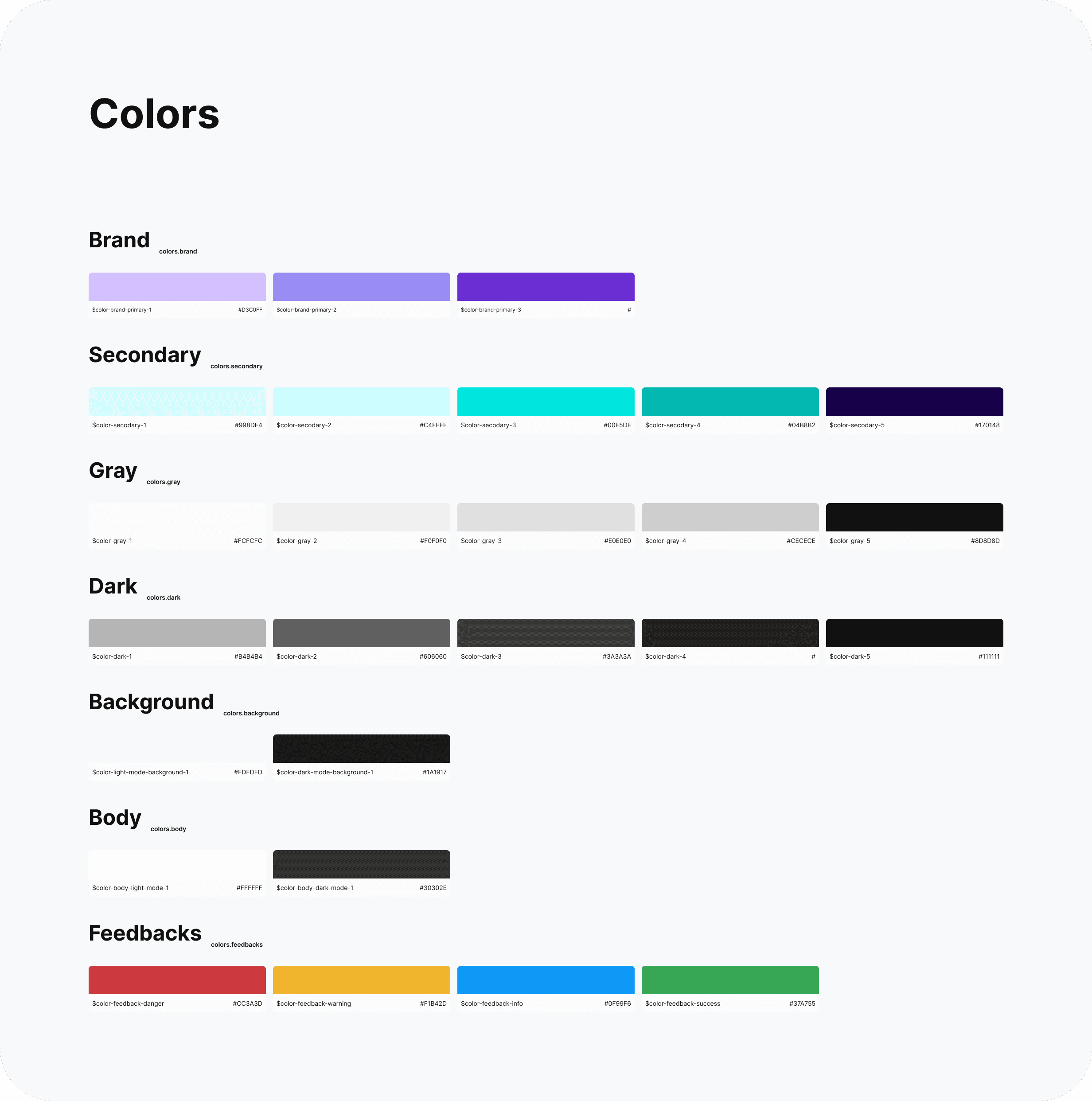
Organization
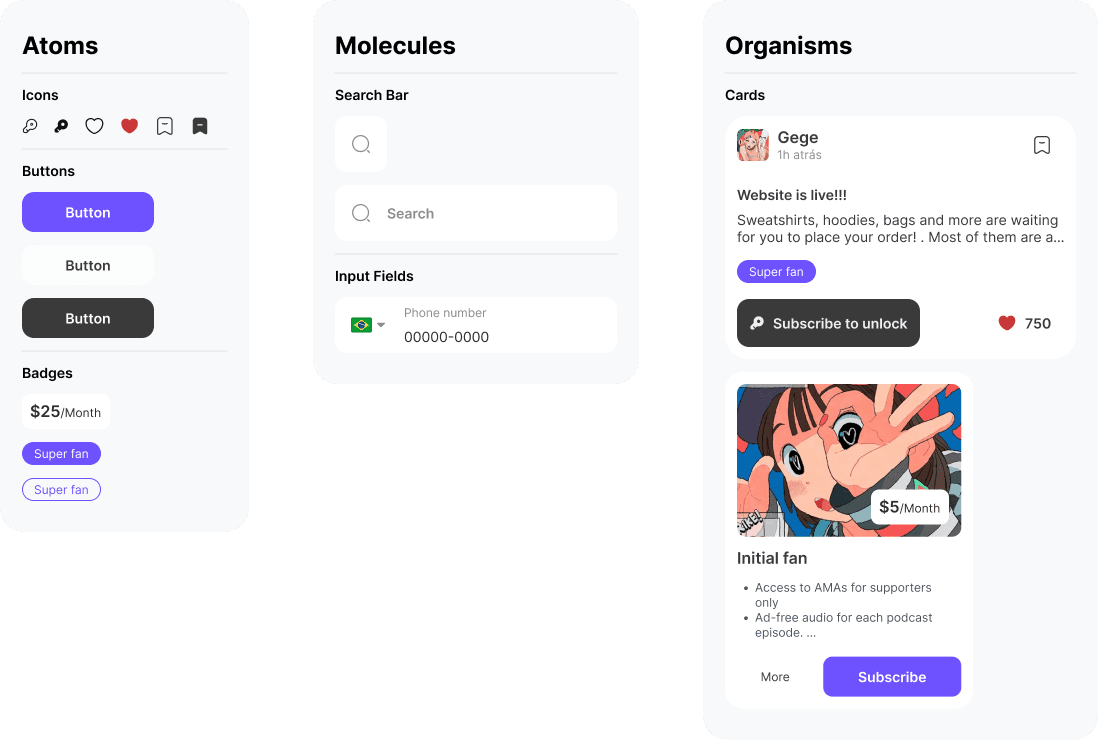
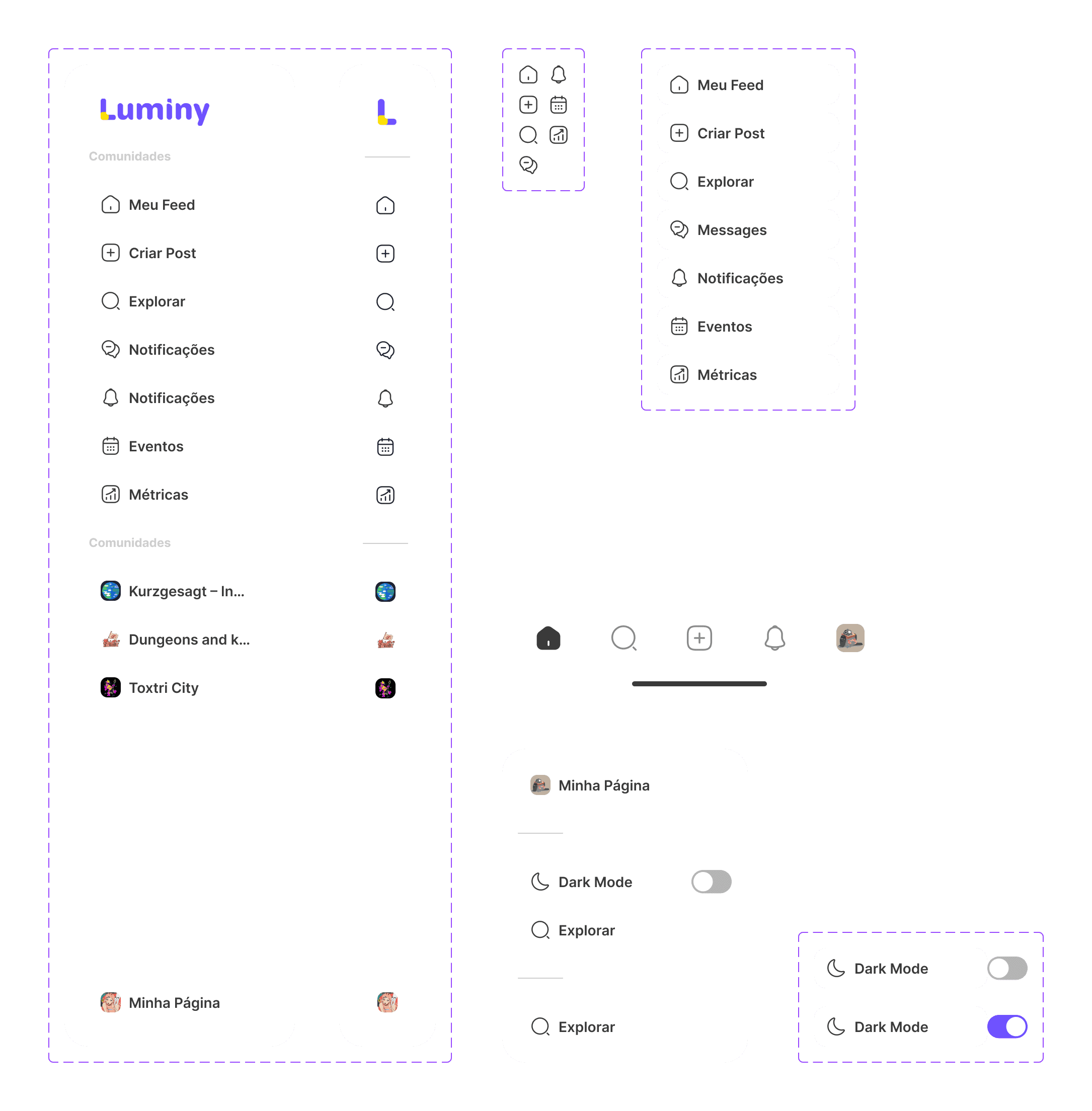
The design system is meticulously organized, thanks to the incorporation of Atomic Design principles.
This approach allowed me to break down the UI into fundamental building blocks, ensuring a scalable and flexible structure. By categorizing elements from the smallest components (atoms) to more complex structures (molecules and organisms), I was able to create a cohesive system that is easy to navigate and maintain. This method not only streamlined the design process but also fostered better collaboration between designers and developers, ensuring consistency across the platform.
Solution
How can I make this helpful for designers and developers?
Recognizing that the needs of developers were just as crucial as those of designers, I knew collaboration would be key. To bridge the gap, I brought a front-end developer into the process early on. Together, we worked to ensure that the design system was not only visually cohesive but also technically feasible and easy to implement.
By involving a developer, we were able to address potential technical challenges upfront, making the design system more robust and user-friendly for both design and development teams. This collaborative approach ensured that the system was built with a strong foundation, capable of scaling as the platform evolved.

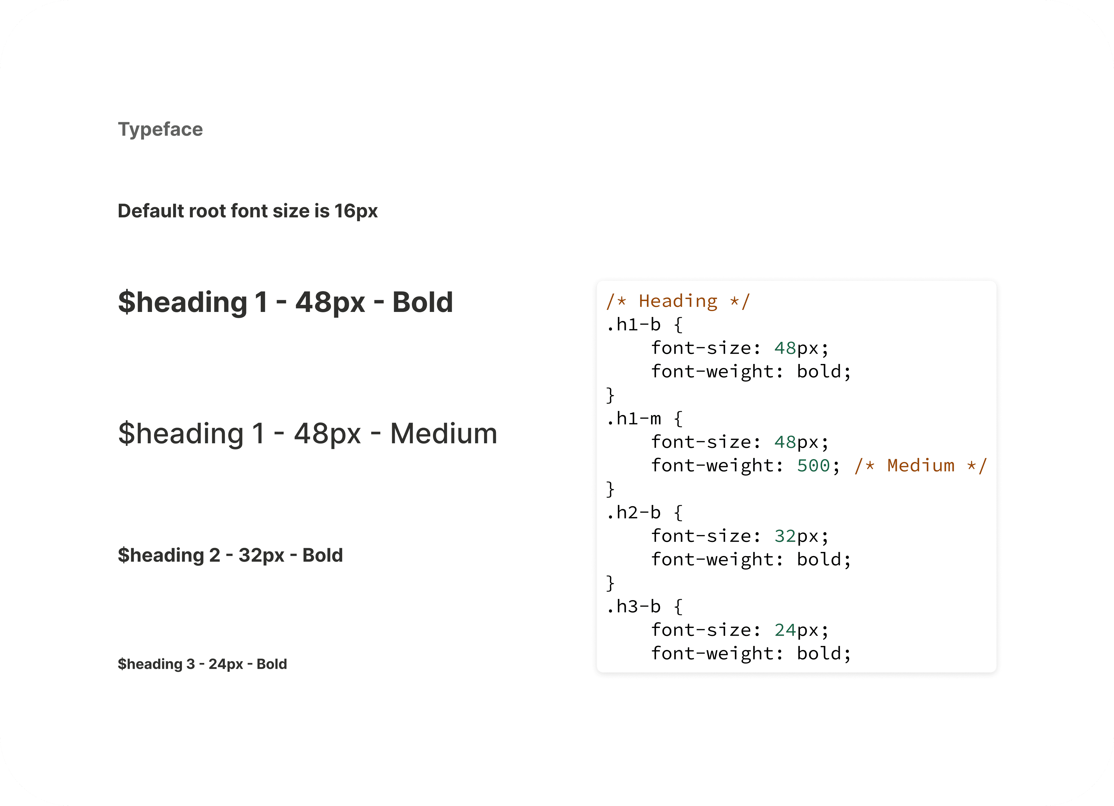
An example of the component specs:


Check it out
Full Name

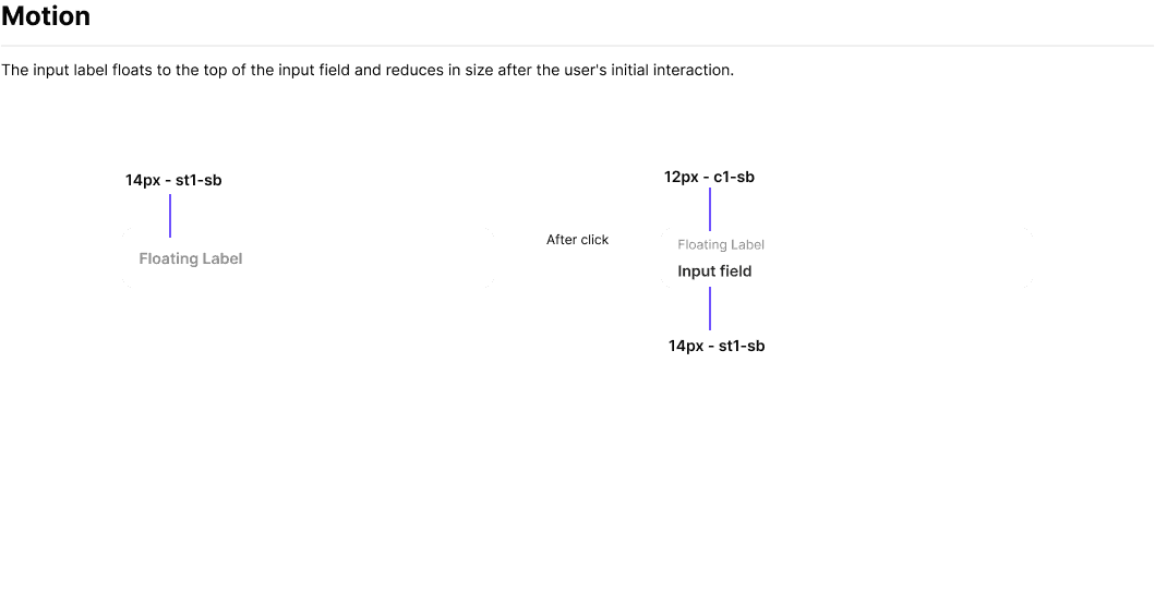
Micro animations
The morphing animation was designed to enhance the user experience by providing a smooth transition between different states of the modal. This animation helps to maintain visual continuity, making the interaction feel more intuitive and engaging.
The purpose of this animation is to:
Guide the User: The morphing effect visually connects the previous and next modal states, helping users understand the flow of the process.
Add Polish: The smooth transitions give the interface a modern and refined look, aligning with the overall design language of the platform.
Keeping It Simple Yet Scalable
I was mindful of the designers who would come after me. I knew that the system would need to grow and evolve, potentially being used by multiple teams across different projects.
By breaking down UI elements into fundamental building blocks, I was able to create nested components that could be easily reused and adapted. This modular approach meant that each component could be updated or expanded independently without affecting the overall system, allowing for flexibility and growth.
Additionally, I utilized component properties to manage variants, simplifying the design process and reducing the need for an overwhelming number of unique elements. This not only streamlined the workflow for current projects but also laid a solid foundation for future designers to build upon, ensuring that the design system remains efficient and adaptable as the platform continues to evolve.

But Did It Work?
The design system is still a work in progress, constantly being iterated upon to adapt to new challenges and opportunities. With the introduction of new components, has it made a difference in the overall product?
According to insights from my development team, the impact has been significant:
🙌 Wins:
Less time spent on coding new components
Handoff is a lot more efficient (less explanation needed to describe elements)
Less back and forth during QA
Coded design is a lot more consistent
Before and after of the plataform: